During the 2010 Census, the U.S. spent over $13 billion collecting information about the U.S. population. If that information isn’t easily available to the public, has that money gone to waste?
That question is currently driving the U.S. Census Bureau to make it easier for people to find and use the Census data online. The Census Bureau is replacing their website with a new version that is currently in public “beta” testing here. This new version is still in early development, but is being rapidly improved upon.
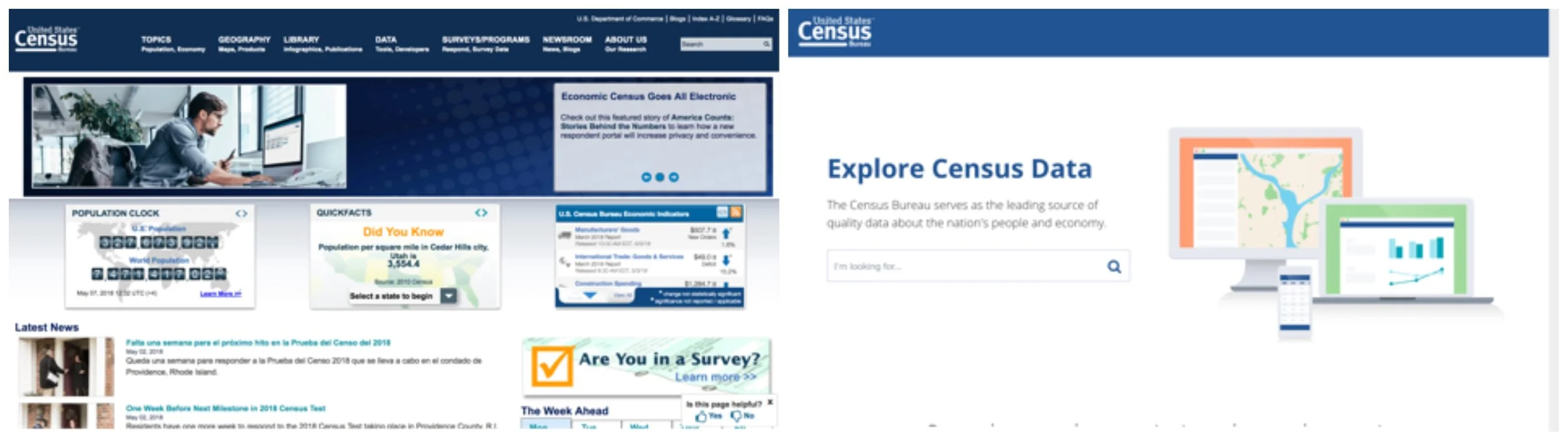
Current Census website (left) and new version in testing (right)
Learning Through User Testing
For the last four months, our student team at the Harvard Kennedy School has worked with the U.S. Census Bureau to conduct user interviews and run user tests on the old and new versions of the Census website. We compiled this feedback, with our own research into best practices, to create multiple prototypes of a potential new Census website. Through an iterative process, we put these prototypes in front of users of the Census website, captured their feedback, and further refined the prototypes through six rounds of testing. Our efforts build on the recommendations and prototypes from an earlier Harvard student team working with Census.

What did we learn?
We learned A TON about the challenges of satisfying a diverse group of users. While our specific recommendations for the Census are below, we think many of these lessons can be applied to any website that contains a large amount of information.
Takeaway #1: Make your full product offerings clear and prominent
During our twenty-five user interviews and forty user tests, we heard one constant piece of feedback, regardless of whether they used the Census website for complex or simple tasks: “I don’t know what information the Census has”.
While this wasn’t surprising to hear from new users, it was somewhat surprising to hear from people who have used Census data for years. It seems that most of the experienced users found a table or survey on the Census website that met their current need, but were still clueless about other data on the site.
For example, the U.S. Census has data available for public use on the following topics: International Trade, Emergency Preparedness, and Health. Very few people that we interviewed were aware of this data.
We integrated this finding into our final prototype by adding topic buttons on the main search page.

Census’ new website currently in beta release. There is no guidance on what data is available.
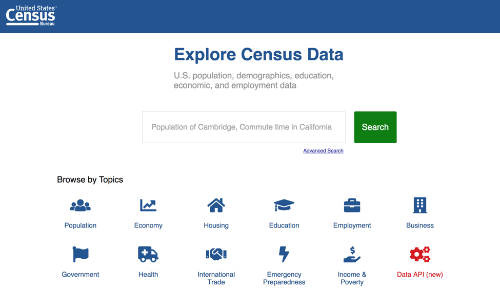
Our team’s prototype with browsable topics added.
Takeaway #2: Create multiple paths to find information to meet the needs of different types of users
We put different prototypes in front of users with varying levels of data experience. Our intention was to compile user feedback into a single best prototype for all users. We quickly learned, however, that this is an impossible goal, since people use the website in many different ways.
During our testing, we focused on three types of people that use the Census website.

Three user personas of the Census website.
As we show below, we found that some prototypes were loved by one group and absolutely hated by the other groups.

Two prototypes we tested with users: Guided search (left) and open search (right)
For example, we tested two types of landing pages: A structured, guided search and an open search box (both shown in the image above). Our “Fact-hunters” user group was quite confused by the guided search, with multiple people stating, “I don’t get it” and “Why can’t I just Google it?”. After years of using Google, they found the open search box much more intuitive.
We were on the verge of scrapping the guided search until we put it in front of more advanced users such as the “Trendies” and “Experimenters”. These groups loved the guided search. They thought the guided search would be helpful to drill down into specific data and were worried that the open search box was too “surface-level” and wouldn’t be useful to find very specific information.
Based on the feedback, we decided that it would be impossible to reconcile all of the groups’ needs and solve them within a single tool. Our recommendation is to build both an open search function and a more structured guided search.
Takeaway #3: Find ways to get your information onto other websites since that is your biggest opportunity for growth.
While user testing a website, it’s easy to fall into myopic view of the problem and focus solely on the design of the individual pages. Move this button up, reorder that menu, etc. But that’s just a small piece of the puzzle.

A reminder that your website is just a tiny piece of the entire Internet.
We found that most users when looking for Census information started by Googling for answers. Unfortunately, the Census website was rarely ranked high in the search result and was only occasionally featured in the quick result on the Google page.

How Census data shows up in a Google search. There are many more search queries in which this could happen.
Additionally, there are a lot of interesting websites and projects that use Census data, but it’s unclear to the average website visitor that the information came from the Census. Take this project by the political website FiveThirtyEight. It’s built by combining Census data with a few other sources, but that fact isn’t prominent on the site. This seems like a missed branding opportunity.
We believe the Census should partner with search engines and media organizations to make Census data widely used across the Internet. For example, the Census could work with Google to ensure that Census data is used in the “quick fact” box at the top of certain search queries, e.g. searches for demographic information as show in the image above. This would be beneficial to Google since the Census data is more accurate than other sources they currently use such as Wikipedia.
Furthermore, to make it easier for website developers to use the Census data in their own websites and products, the Census needs to overhaul their API (Application Programming Interface), The Census is currently working on a new version of their API which should be released sometime this summer.
Next Steps for the Census
Our group presented detailed findings for the Census in Washington DC in May. Our presentation can be viewed here. The team at the Census is already making strides in redesigning the website and making it easier for the public to find and use Census data. We are excited that our efforts might help and influence Census in its important mission to inform the American public.
Daniel Drabik, Tony Thumpasery, Ayush Chakravarty, Arjun Bisen, Carissa Chen


