This blog is the fourth in a series produced for a Harvard Kennedy School field class on innovation in government. Our team is working with the MassIT Digital Services team and the Massachusetts Executive Office of Housing and Economic Development (EOHED). You can read about our project here, and our experience learning about entrepreneurs in Massachusetts here. A recap of how we turned our user interviews into business problems can be found here.
Since January, the Commonwealth Team has been working to understand how the Commonwealth of Massachusetts can better support entrepreneurs. We interviewed a number of existing and potential entrepreneurs and over the past few weeks developed specific insights (read more in our most recent blog post). After a few follow-up interviews to confirm our insights, it was time to build a solution for our users.
As we started this first step into user centric design in January, this is the stage of the problem has had our team most nervous from the outset. On paper, meeting with users and understanding their challenges sounded ‘easy’, but figuring out how to come up with a solution to their issues seemed much more daunting. After all, if there was a straightforward solution, wouldn’t someone have found it already?
Generating Solutions
Our team started the process with brainstorming sessions spanning multiple days. After some initial ideation as a team, we held an open brainstorming session with our client team, where we employed a Magic Wand brainstorming tool. By asking our team and our clients to use their “magic wands” to conjure up solutions that might otherwise be dismissed as unrealistic, we were able to come up with almost 40 unique ideas to help entrepreneurs! These ideas ranged from simple things like making existing resources more readily available to proposing comprehensive legislative recommendations. All of these ideas were potentially interesting, but we needed a way to choose a few that we could start to prototype and test with users.
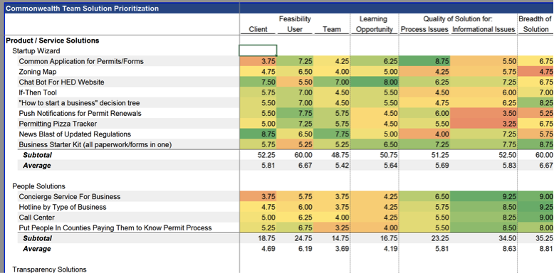
Above is a small sample of our solution prioritization analysis
To help narrow down the solutions we thought through some criteria we could use to evaluate our options. We landed on the following:
- the feasibility of the solution being developed
- the extent to which the solution would solve an existing problem for users
- the breadth of users our solution would reach
- the learning experience it would offer for our team and clients
Each team member individually scored each proposed solution against these criteria using a ten-point scale and submitted them via a ‘secret ballot’. One of us then consolidated our rankings into the spreadsheet above. From this ranking, five solutions came out on top:
- A crowdsourced FAQ platform
- The development of a public event schedule for entrepreneurs seeking support
- A newsletter / notification system for sharing regulatory updates
- A permitting wizard
- An online setup for ‘office hours’ with state and local officials
After a lengthy discussion of these alternatives with our client team from EOHED, we determined that it would be best for our team to focus on the FAQ platform and permitting wizard given their potential for impact. As for the other 30+ ideas we had? We made sure to log them for our clients’ next round of innovation initiatives.
Solution Design and Prototyping
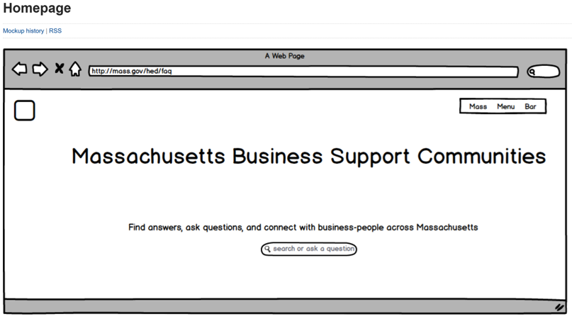
When it came time to actually start building, the team relied on Nisha’s design and technical expertise. After a few short conversations with our clients, she was able to pull together some mockup wireframes that we used so we could have something visual to help us think through our solution’s features and design elements. Having these wireframes made the solutions much more tangible and allowed us to have specific conversations about the wording on the page, the content of drop-down menus or where we should put the buttons.
Early wireframes of our solution
The debate about features and design details for our solutions was extensive. Despite agreeing on user insights from our research, we each had different views on how to best develop a solution. After some time, we were able to reach an agreement about what our first interactive wireframe for our “FAQ” solution should include for our first test with users. Nisha then created the FAQ site and, after a couple of rounds of internal comments, our prototype was ready to be tested.
The current prototype of our entrepreneur FAQ hub
User Testing
With our prototype ready, we headed over to Burlington, MA to meet with a three-time small business owner who is very involved in the City’s Chamber of Commerce. He was excited when he saw that he could browse questions by popular topics and not only by search bar and mentioned that this would be the perfect tool to refer Burlington entrepreneurs to. In a second user test, we discovered that our user preferred the search bar to the popular topics method, validating our assumption that different users have different preferred searching methods.
These user tests were exciting not just because of the helpful information they gave us about the design of our site, but because we got to see the look on the faces of the entrepreneurs using our tool. Seeing them get excited about what this site could do for them and their peers has made the late nights and sticky notes much more meaningful.
We will spend the next two weeks testing our solutions with users to refine our prototype and develop a set of recommendations for our clients. But we can say now, with our prototype in hand, that we can do so more confidently than when we started this phase. Getting to a quick idea, testing and building on it takes away the intimidation that goes with trying to think of the perfect solution to a problem right away, and is something that will stick with us far beyond this project.
-Artyom, Brian, Julia, Kate & Nisha


