Any kid who plays with LEGOs can tell you that there is a thrill to building something new. As our team transitions from user insights to prototyping, we’re learning that the thrill of creation can be even more satisfying when your concepts are informed by deep user insights.
So far in our semester-long course at the Harvard Kennedy School on Technology & Innovation in Government, our team has taken the time to better understand the disability benefits appeals process, interview veterans and synthesize user insights. Now it is time to turn those insights into product ideas that could improve the experience of U.S. veterans who are appealing their disability benefit decisions. Our prototyping journey so far has been split into three phases: 1) brainstorm, 2) prioritize, and 3) test.
1. Brainstorm: No idea is off-limits.
Our team started by listing the five main themes that emerged from our interviews with veterans, and brainstorming solutions. We adopted a few norms proposed by IDEO, a leading design and innovation consulting firm. One of the more unusual norms was to “be visual” by drawing on our post-its as we conceived of the ideas. The little sketches really helped us to convey the idea’s essence and remember each idea long after the session.
Some ideas that emerged were potentially transformative but would require a lot of changes to existing processes. For example, Chetan wondered if we could ‘flip the system’ by having Veterans’ Service Organizations work with veterans to determine their initial ratings, and having the VA double check a smaller portion of the claims. This would bring the VA in line with best practices at private insurance companies, where claims are processed relatively efficiently because only a sample of claims is audited.
Other ideas would really increase the ‘human touch’ of a system that currently feels impersonal. Paris thought of a case manager, a single person at the VA in charge of your case who you could contact through phone or text. Jane wondered if VA raters could create an audio narrative of their decision—like a doctor dictates their notes—and Josh built on this idea by proposing veterans also be allowed to submit audio narratives in support of their claims. Rohan proposed a “Khan Academy for Veterans,” where veterans could learn more about the process through videos, rather than confusing instruction sheets.
2. Prioritize: Narrow the list.
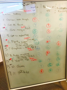
Our brainstorming session generated over 50 ideas. We narrowed the list by focusing on three criteria:
- Impact on the Veteran: Would the idea meaningfully improve the appeals experience of a veteran?
- Burden on the VA: Does the idea decrease the amount of resources the VA would need to process the claims?
- Feasibility of testing: Can we think of a way to test the idea before May?
The pictures below show 12 of our finalists and how they fared across these criteria. We chose three concepts to test:
- Yelp for VSOs: A platform that links veterans to veterans' service organizations (VSOs). Veterans would be able to see services offered, schedule appointments, and connect to other veterans' reviews of the VSOs
- Vets Academy (modeled after Khan Academy): A portal where veterans can access user-generated, expert curated videos on issues throughout the appeals process. Should include a step-by-step overview of the process. This could be a VA resource that is promoted to the VSOs and in transition training.
- Form 9 Redesign: Form 9 is where veterans note their points of disagreement, and choose the type of hearing they would prefer (hearings can be in person in DC, by teleconference, at a regional office, or the veteran can choose to waive a hearing). The concept is to improve the overall look and feel of letters to increase trust, usability, and form effectiveness.
Our whiteboard prototype
3. Test: The rougher the prototype, the better.
A founding member of the U.S. Digital Service, Erie Meyer, visited our class to give us tips on how to ‘hack bureaucracies’ and launch successful technology projects in governments. Erie’s biggest piece of advice was to make early prototypes as ugly as possible. She even offered a personal White House tour to the team with the ugliest prototype! Why? According to Erie, a rough prototype allows testers to be more creative, and encourages testers to think more about the concepts and ideas rather than the design. Rough prototypes also prevent a team from being overly committed to an idea based upon the time and effort it took to create the prototype.
Challenge accepted, Erie. In the next week, our team will create three “ugly” prototypes and test them with veterans.
Chetan Jhaveri, Jane Labanowski, Paris Martin, Rohan Pavuluri, Joshua Welle

