The final week in our student project for the New York Department of Buildings (DoB) has begun! Eight weeks ago our team of five Harvard Kennedy School students kicked off a user research process to help the DoB improve construction safety.
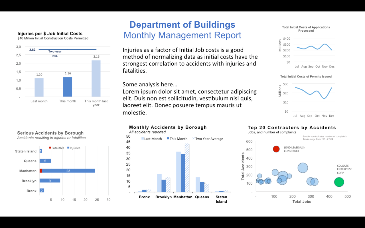
Specifically, the DoB wants to use data on past accidents to reduce accidents on construction sites in the future. We spent the past couple of weeks finding the right indicators for safety, crunching numbers, and designing a dashboard. From a rough sketch on a piece of paper we developed this four-page prototype in power point to present to three managers in the DoB.
Last Monday, we put this prototype in front of DoB manager for the first time to test how well it met user needs. We wondered: which of our graphs are most helpful for our users in preparation for a management meeting? And have we presented the data in a form that is easy to grasp in their very short time available as busy DOB managers?
We emailed the prototype to our users only minutes before we called them, to mimic the actual time they usually have to engage with an analysis before a meeting. Then we followed them in real-time on the phone as they worked their way through the prototype, marked how their eyes traveled over the paper, and noted their reactions to each part of the dashboard in different colors.
Our users (DoB safety managers) had near unanimous feedback on our prototype. For example:
- They all wanted us to cut the graphs on the upper left corner and the upper right corner of the page out of the dashboard. Their reactions to the graph on the upper left side were strong and very similar. They said “this is not at all helpful!”, “I am never asked for this information”, or “this is not important to me.”
- The users wanted a short summary of the most important results in the middle of the page.
- The fonts were mostly too small for them.
Our next step is to review the design choices we made, rework the prototype, and user-test before our final class, Demo Day. We want to present the same data, more clearly in the next iteration of the dashboard. We intend to test an important question: were the graphs confusing or was that masking a larger problem of the actual data not being useful?
Anthony Arendt, Dan Bacon, Howaida Kamel, Kirsten Rulf and Daniel Wagner


